Search
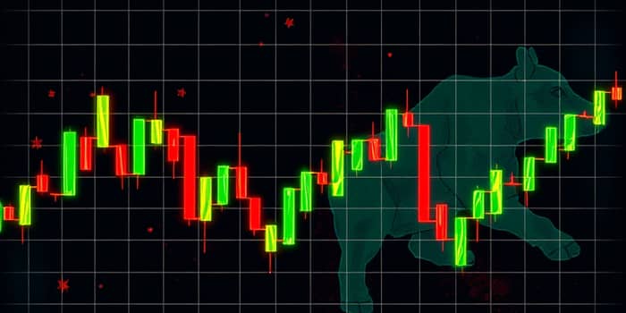
Candlestick charts have become an indispensable tool for traders and analysts seeking to visualize market sentiment instantly. By compressing complex price data into intuitive graphics, these charts offer a window into the psychology of buyers and sellers within each time period.
In this article, we explore the anatomy of candlestick charts, the patterns they form, and how traders use them to forecast potential price movements.
At their core, candlestick charts distill four critical price points—open, high, low, and close—into a single visual element called a candle. Each candle represents a defined time frame, such as one day or one hour, revealing market sentiment at a glance.
Understanding the structure of a candle is essential before diving into pattern analysis.
With these elements in place, traders can quickly assess the balance of power between buyers and sellers over any chosen time span.
Candlestick formations serve as visual metaphors for the ongoing battle between bulls and bears. A long bullish candle suggests buyers dominated the session, while a long bearish candle signals sellers held sway.
Patterns reflect collective sentiment; a sequence of candles can reveal growing confidence, hesitation, or panic among participants.
Interpreting these shapes requires context: a single candlestick may indicate indecision, but when it appears at a trend’s end or after a consolidation, it can herald a significant reversal or continuation.
Traders classify patterns into broad groups based on their predictive intent and formation structure.
Reversal patterns alert traders to possible trend changes. Below are some of the most reliable formations.
Bearish reversal patterns work similarly but invert the psychology, warning of impending downward moves.
The Shooting Star features a small body and a long upper wick after an uptrend, indicating that attempts to push prices higher were rejected. Research shows it has about a 59% success rate in forecasting downturns.
The Three Black Crows formation—three consecutive long bearish candles with lower lows—signals strong selling pressure and registers around a 78% accuracy in predicting sustained declines.
Continuation patterns appear during pauses in an ongoing trend, offering traders opportunities to enter in the direction of prevailing momentum.
Identifying continuation patterns can help traders avoid false breakouts and align entries with the main trend.
Academic studies and market analyses have quantified the reliability of various candlestick formations, providing valuable benchmarks for traders.
Below is a summary of success rates for key bearish reversal patterns.
Research by experts such as Dr. Thomas Bulkowski shows that while candlestick analysis excels in visual clarity, combining it with volume or moving averages does not always improve predictive accuracy.
Success ultimately depends on disciplined pattern recognition and contextual interpretation.
To harness candlestick charts effectively, traders often use them alongside other technical tools, such as moving averages or momentum indicators, for confirmation.
Sequential candle observation is critical: a single signal can be misleading, whereas a confirmed pattern spanning multiple candles reduces false positives.
Additionally, cultural variations in chart colors and styles mean international traders should verify local conventions before making decisions.
Candlestick charts offer a powerful blend of simplicity and depth, transforming raw price data into actionable visual insights. By mastering their anatomy, interpreting key patterns, and acknowledging their limitations, traders can gain an edge in predicting stock price movements and navigating volatile markets.
References